CLASHING COLORS, ADS AND MORE

Build a smart actor website in 90 seconds! Click here to begin.

Clashing colors, ads and more

Actor Website sin #-1

Thou shalt not use clashing colors on thy outdated actor website

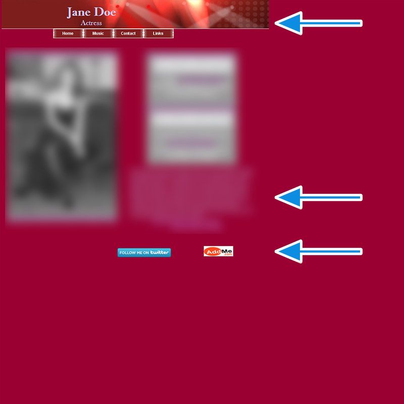
1990s called. They want their website back. Oh wait, they couldn't call, they were using the phone line for the dial-up. Maybe they faxed? Yes, they faxed.

This one is all squished in the upper left corner, which means it was probably designed in the 20 years ago. Clashing colors of purple on pink make things difficult to read for most and then the things that pop the most on the website are not your resume, not the "contact me" link, not the "hire me" link, but the twitter links and an ad.

Analytics: Understand Your Audience on Your Actor Website

04.19.2024 Unlock the Power of Your Audience: Harness the Benefits of Analytics to Maximize Your Actor Website's Potential
Check it out »

Balancing Life and Acting: Maintaining a Healthy Lifestyle

04.05.2024 Achieving Your Dreams: How to Balance Life and Acting While Staying Healthy and Ready to Shine!
Check it out »

Niche professional websites for people in the film and TV industry.

Weeee, you found me!

I'm your buddy Bottie, I was hiding behind the scenes, but now that you've found me I'd be happy to tell you what I'm doing.

Actor Website helper: Bottie

I just wrote a few fun facts about Web For Actors

Would you like to take a look?
Click here to check them out. I hope it will cause involuntary audible response.